Project

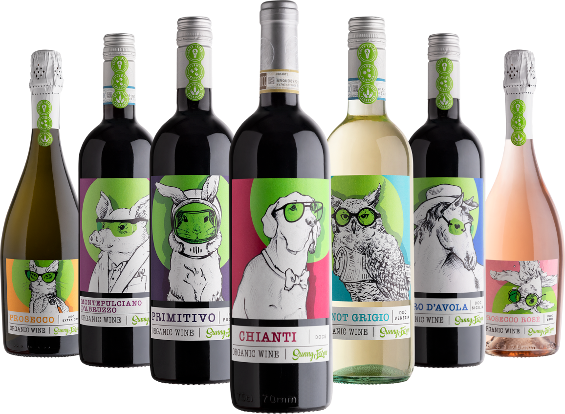
SunnyFarm is a capsule collection of nine certified organic and vegan wines.
Pizzolato winery produced this line four years earlier to spread messages related to climate change through a friendly group of farm animals.
The line had shown its potential founding good interest in Northern Europe and Asia.
With the addition of two new wines in the line that would be marketed in recyclable aluminium cans, Pizzolato has decided to take over the entire line for a total re-style on the packaging. Furthermore, with the new labels of the line, the website also needed to be studied from scratch to represent the new SunnyFarm look.


Client
Pizzolato is an Italian wine producer located in Villorba in the province of Treviso. Pizzolato winery can claim of being among the first wineries in Italy to produce all its wine lines from Organic and vegan wines since 1991. Discover more.
Sunny Farm is the first of four websites for Pizzolato Winery that we will lunch between 2021/2022.
My Role
This project shows how UX/UI and classic illustration styles can mix up together to create a fresh, highly-engaging and easy-to-consume design language throughout the website!
Wine label illustrations
I had the pleasure of illustrating all the new animals for the SunnyFarm line, collaborating with Onice Design Studio, and curating typography and label.

UI/UX design and Project managment
For the website, I cover the role of Project manager and UI/UX design in close collaboration with the Spaceneil agency in charge of site development and technical support.
The Work
The work was divided between traditional illustrations for wine labels and the SunnyFarm website that included planning and organizing the project, studying the navigation and the functionalities, creating a unique interface, and supervising the design implementation.
Kick-off
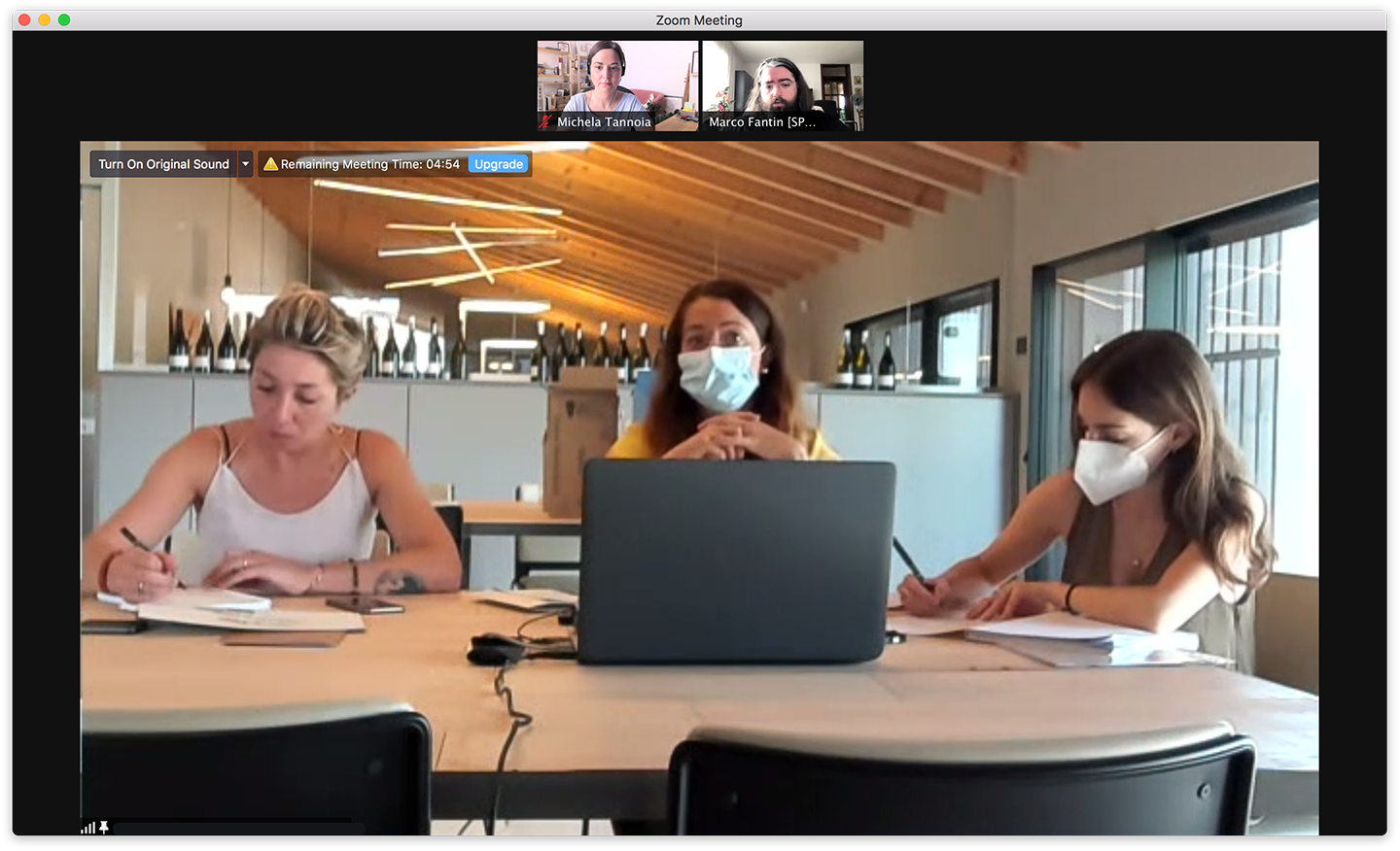
Initial kick-off with Sabrina Rodelli, stakeholder of the project and her team to define targets, goals and future expectations.
After we define these key points, we plan the methodology of the work between teams. One by one, we all answered a series of pre-compiled questions I prepared for this occasion to define from the beginning which channel of communication each team wanted to use to be contacted for essential updates, important communications and video calls.
We establish a limit of time in days for answers to questions or delivery feedback to avoid blocking each team's work.
Wireframes and prototype
After having agreed on the navigation, wireframes on paper and Figma of the entire website were created. These wireframes were essential in order to have an open discussion with the team leader of developers Marco Fantin, co-founder of the digital agency Spaceneil. Here we were able to define and determine architectural details of the future website, including possible technical limitations to be brought to light with the client from the first steps.
A simple prototype in Figma has been created to present to the stakeholder and her team. In this way, the client had the opportunity to have a clear vision of the final project.

Visual exploration
The SunnyFarm wine label (conceived by Stefano Torregrossa, art director of Onice Design Studio) influenced the website's final design.
For the design style, I took inspiration from the contrast between the brand green, with acid tones, combined "without regard" to warm or cold colours bolstered through opposite geometric shapes such as circles and rectangles. The peculiarity of the combinations reminded me the English swinging style of the 60s.


Still life product, photography elements and vectorial shapes
To connect even more to the 60s theme, I combined a very light touch felt material texture and some photographic elements to remember the collage style often used at the time.

Pizzolato wanted this website to be a place where they could have fun. So colours and animals have to be protagonists both inside and outside the bottles.
As a stylistic choice, I maintain a clean and geometric structure for smooth navigation. Still, in respect of the Pizzolato playful vision, the well-arranged products are always "not aligned" or "not forced" within the limits of a container. Exactly how the SunnyFarm product and message has never been.

Animations
The client wanted a few animations to create dynamicity during the navigation. Unfortunately, there was no availability of an interaction designer for this project, so with Spaiceneil, we had a long session sit side-by-side to curate each animation. In addition, we focused on keeping the excellent performance of the website on tablet and mobile.
Launch
The launch of the SunnyFarm website took two days of working closely with the development team. In this period of time, we have worked non-stop to be sure (even if in these things you can’t ever be sure) to come out with a bug-free website and with an interface that fully respects the design approved by the customer.
We have 4 breakpoints designed, so, during these sessions, each of them has been fixed, cleaned, tested and reworked again.

The Challenge
The main challenges we faced are:
Create a website for a modern target without falling into a childish style.
Manage elements and colours that risked ageing the visual impact, making them instead fresh and tidy.
A significant challenge was the many changes made while creating the designs and building the website. In fact, the creation of the website went hand in hand with the production of the new wine line and the new labels that were studied when we were already in the wireframing phase.
What I learned
I learned from this project that having an excellent relationship with the agency you work with is essential, especially if the project requires many changes. Knowing that you can work in harmony without a bad mood in the air already halves the efforts you will have to face.
To conclude, I want to share a lesson that I learned many years ago but perfectly apply to this case: working while having fun with the development team and the client (or stakeholders) leads to studying a product of quality and harmony that I hope will shine through on the website itself.
